Boosting conversion with value props
Designing a global cryptocurrency platform that enables users to safely buy, store, and learn about digital assets through an accessible iOS and Android app.
Role
Senior Product Designer
Product
Cryptocurrency Exchange
Platforms
iOS · Android
Focus Areas
UX, Visual Design, Research
Context
Luno is a global cryptocurrency platform operating across Africa, Oceania, the US, and Europe. The product enables users to safely buy, store, and learn about cryptocurrencies.
Despite strong top-of-funnel performance — driven by effective marketing campaigns, App Store optimisation, and paid acquisition — a significant drop-off occurred immediately after install. Less than 50% of users who downloaded the app proceeded to create an account.
This indicated a disconnect between acquisition messaging and the in-product experience.
The Problem
Users were arriving with interest and intent, yet failing to convert.
The onboarding flow did not sufficiently reinforce Luno's core value proposition at the moment of highest intent — immediately after install.
We needed to answer a critical question:
How might we better communicate Luno's value in the first 30 seconds of product experience?
Hypothesis
If we more clearly and effectively communicated Luno's value proposition during onboarding, we would increase the likelihood of users progressing from install to signup.
Goal
Increase install-to-signup conversion by 10%.
This metric was directly tied to growth targets and acquisition efficiency.
Exploration & Competitive Review
I began by analysing onboarding patterns across crypto, fintech, and high-trust financial apps to understand:
- How competitors framed value early
- How trust and safety were communicated
- Whether onboarding emphasised education, speed, or benefits
- Patterns in motion, pacing, and interaction
We synthesised findings in collaborative Miro workshops, generating multiple conceptual approaches:
- Video-based onboarding
- Animated explainers
- Story-style walkthroughs
- Micro-surveys for personalisation
- Multi-model onboarding (self-select, quick start, benefits-led)
- Static or dynamic carousel approaches
Given the two-sprint implementation window, we used an impact vs effort matrix to prioritise a solution that would maximise clarity while remaining feasible within constraints.
Strategic Decision
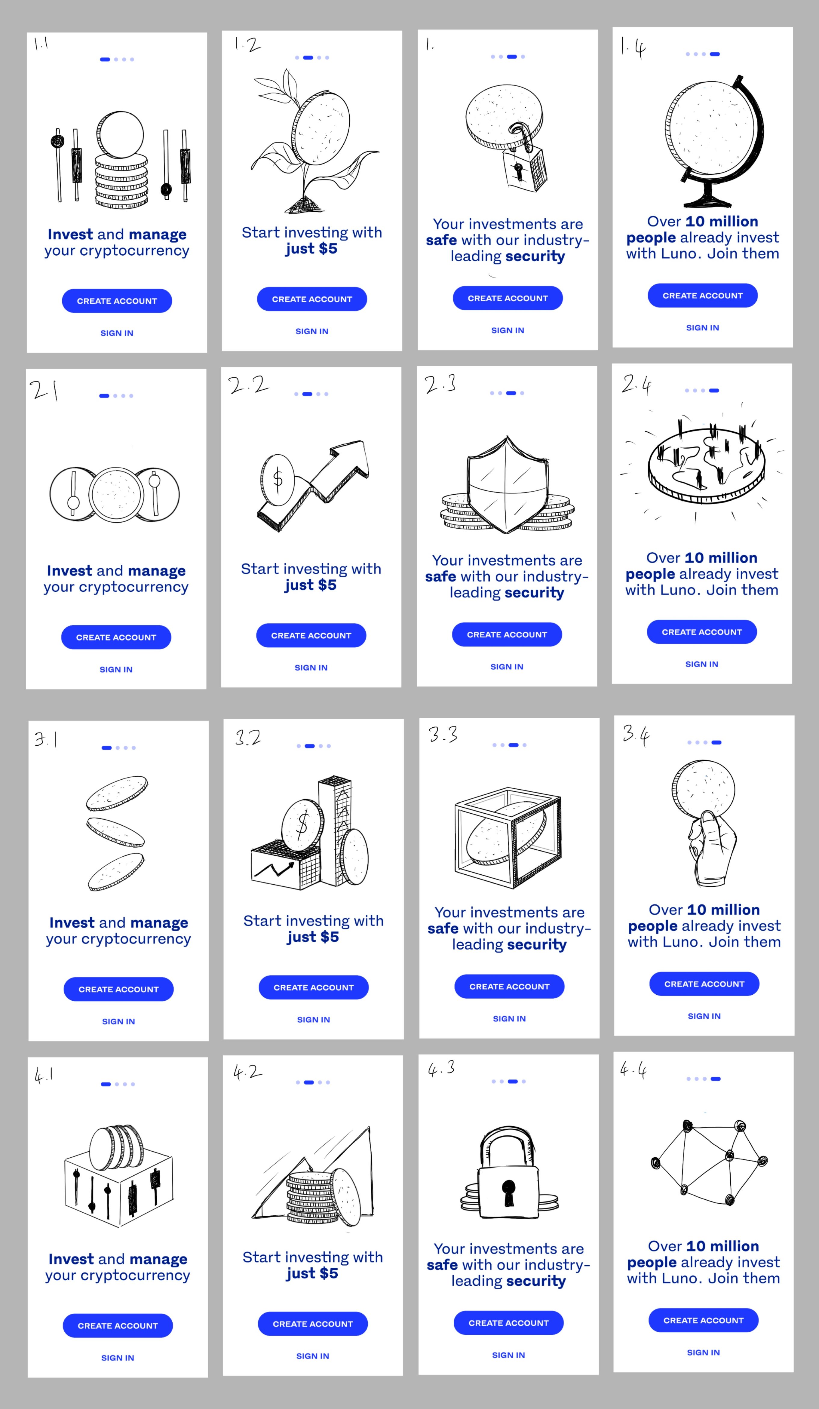
We chose a value-led onboarding carousel.
This approach allowed us to:
- Reinforce key benefits before account creation
- Maintain simplicity within the existing system
- Deliver within engineering timelines
- Test impact cleanly against the existing baseline
Design Exploration
Working within Luno's established design system, I explored how far we could elevate the experience while maintaining consistency.
Areas of experimentation included:
Pagination
- Visual prominence
- Placement hierarchy
Copy
- Character limits
- Font weight for emphasis
- Positioning relative to illustrations
Buttons
- Fixed vs contextual placement
- CTA hierarchy and copy clarity
Carousel Behaviour
- Auto-scroll vs manual control
- Transition timing and easing
- Background colour shifts between slides
Illustration Integration
- Scale and spatial balance
- Alignment with messaging
Sensory Feedback
- Subtle haptics
- Motion on splash entry
The focus was not decorative enhancement, but increasing clarity, scannability, and perceived product confidence.
Collaboration
I partnered closely with a UX writer to define a cohesive narrative across four slides.
We aligned messaging with high-performing marketing language already proven effective in acquisition campaigns. This ensured continuity between external ads and in-app experience — reducing cognitive dissonance.
Once copy was finalised, I briefed the illustrator to produce four supporting illustrations that reinforced clarity without overwhelming the interface.
The tone needed to communicate:
- Trust
- Simplicity
- Global credibility
- Educational support
Validation & Delivery
A high-fidelity working prototype was created to:
- Demonstrate transitions and pacing
- Validate timing decisions
- Align stakeholders before engineering build
Detailed implementation notes were provided to engineering, covering animation timing, state changes, and interaction rules to ensure fidelity to design intent.

Impact
The redesigned onboarding strengthened the communication of Luno's core benefits at the most critical moment in the user journey.
The work directly targeted and contributed toward the 10% install-to-signup conversion uplift goal by:
- Reinforcing value early
- Reducing ambiguity
- Aligning product messaging with marketing acquisition
Improving clarity within the first-time user experience
Key Learnings
Acquisition messaging must align with product experience.
Conversion drops often indicate a mismatch between expectation and reality.
Onboarding is positioning.
It is not a tutorial — it is your first value statement.
Constraints drive clarity.
Two sprints forced prioritisation and prevented overdesign.
Micro-decisions compound.
Pagination, copy weight, motion timing — small details meaningfully impact perceived quality and trust in financial products.