Zero to commercial success in a year
Designing an AI-powered sports analytics platform that makes complex data understandable, trustworthy, and engaging for everyday fans.
Role
Founding Product Designer
Product
B2C Subscription Platform
Platforms
iOS · Web
Focus Areas
UX, Visual Design, Brand, Data Visualization, Design System
Overview
GameScript.ai helps sports fans navigate advanced analytics through AI-generated predictions and expert insights.
I led design from early concept through launch, shaping the product vision, brand, UX foundations, and visual language for a data-heavy consumer experience.
Product Vision
Design and deliver an intuitive analytics experience that empowers sports fans to:
- Understand game predictions and player performance through AI insights
- Access curated content from top sports analysts
- Explore deep data without technical expertise
- Subscribe easily and stay engaged throughout the season
Product Challenges
Problem Space
Sports analytics data is incredibly dense and complex. Fans want:
- approachable insights, not raw data
- contextual narrative around predictions
- trustworthy recommendations that explain why specific insights matter
Design challenge: Translate extensive AI predictions and human expert insights into digestible, engaging UI - without overwhelming the user.
Consumer Challenges
- Users unfamiliar with sports analytics terminology
- Need to balance simplicity for casual fans with depth for advanced users
- Subscription conversion requires clear perceived value
Design Strategy
Principles
-
Clarity through visuals
Use visual hierarchy and clear micro-animations to make statistics approachable. -
Narrative first
Combine text and UI to tell why an insight matters (e.g., “AI projects this player's scoring likelihood at 78% because…”). -
Predictive transparency
Explain AI confidence scores so users trust rather than distrust “black-box” suggestions. -
Engagement loops
Push notifications and home feed highlight new insights, trending players, and expert picks.
Brand & Visual System Foundations
While the product vision was clear, the brand lacked a cohesive identity that could communicate both analytical credibility and emotional energy.
My goal was to create a visual system that felt:
- Intelligent but not overly technical
- Confident without feeling like a sportsbook
- Data-driven yet accessible to everyday fans
Before designing visual assets, I worked with product leadership to define core brand attributes:
- Insightful — grounded in real data and AI confidence
- Transparent — predictions explained, not hidden
- Dynamic — responsive to live sports momentum
- Fan-first — built for enthusiasts, not analysts
These principles guided every visual and interaction decision.
Colour Strategy
The palette was designed to balance energy and authority:
- A deep, near-black foundation to evoke sports broadcast environments
- High-contrast accent colours to represent confidence scores and performance momentum
- Semantic colour roles (confidence, risk, trending, neutral) embedded directly into data visualisation components
Colour was not decorative — it carried meaning across predictions, probability states, and outcomes.
Typography & Hierarchy
Given the density of sports data, typography became a functional tool.
I introduced:
- A bold headline style for predictions and key metrics
- A highly legible numeric treatment for odds, percentages, and confidence scores
- A structured hierarchy that reduced cognitive load when scanning data-heavy screens
The result was a system where users could scan insights quickly without feeling overwhelmed.
Illustration & Motion
To humanise the AI layer, we avoided abstract “robotic” visuals and instead focused on subtle motion and contextual illustrations.
- Micro-interactions reinforced confidence changes and status updates
- Motion was used to communicate live updates and momentum shifts
- Transitions were fast and deliberate to mirror the pace of sports
This created a product that felt responsive and intelligent — not static.
Feature Highlights & Design Decisions
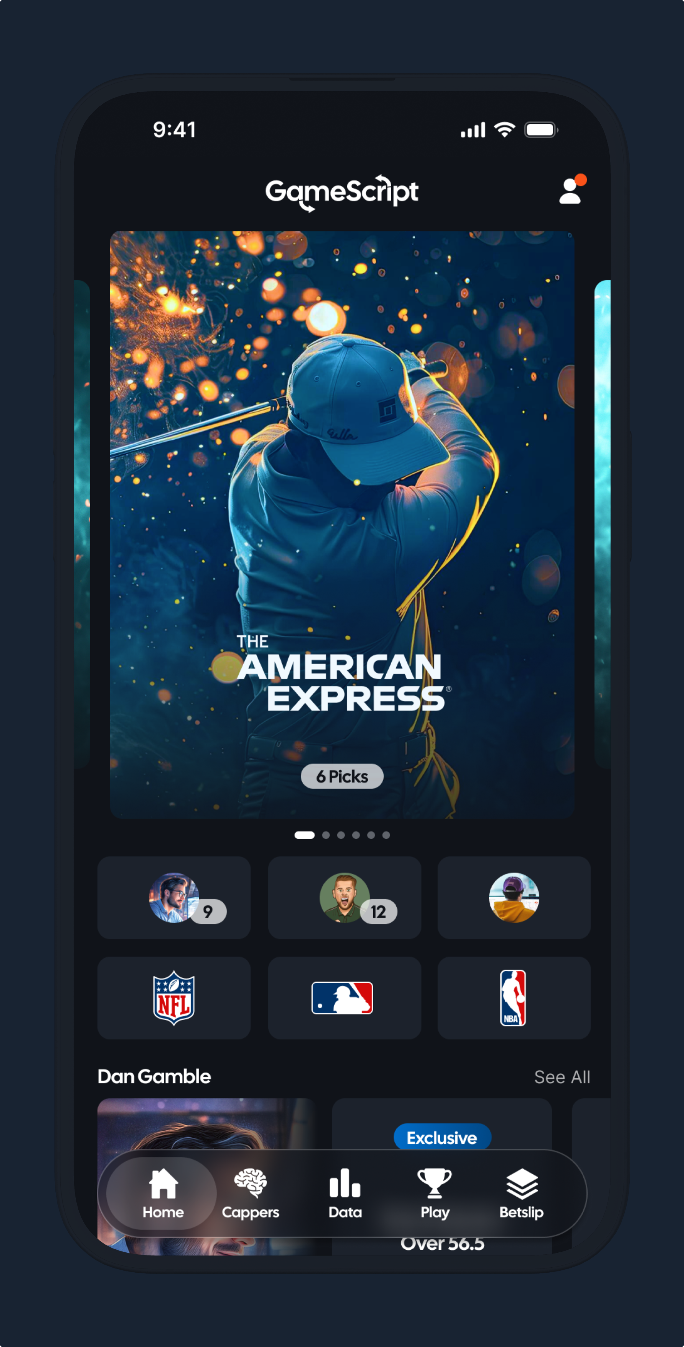
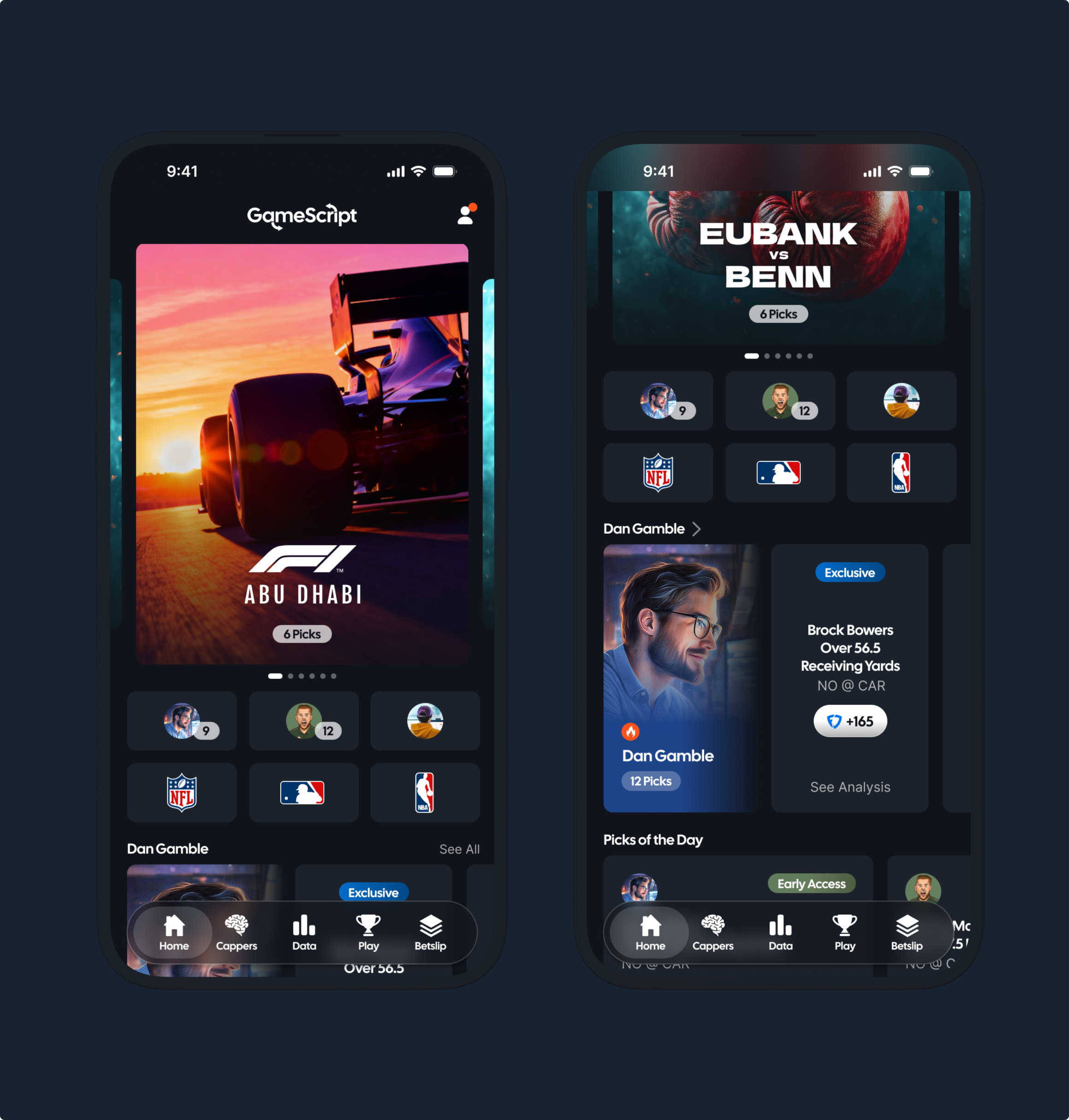
Discovery Screen
Design goal: Meet users with a digestible overview of forecasts for today's games.
UX decisions:
- Top games/events carousel with quick prediction scorecards
- Trend highlights (e.g., stat momentum, hot players)
- Content cards linking to deeper projections
Impact: Users can scan at a glance what's happening today before drilling deeper.
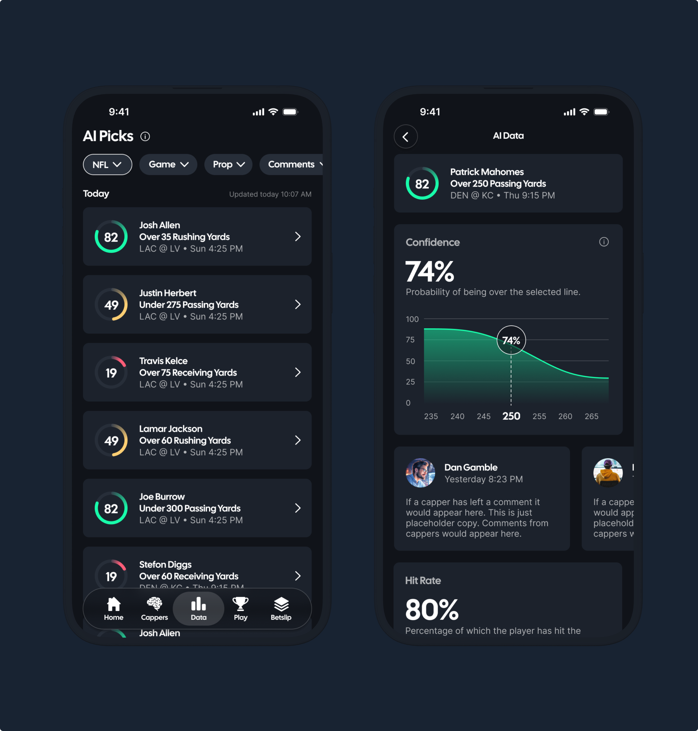
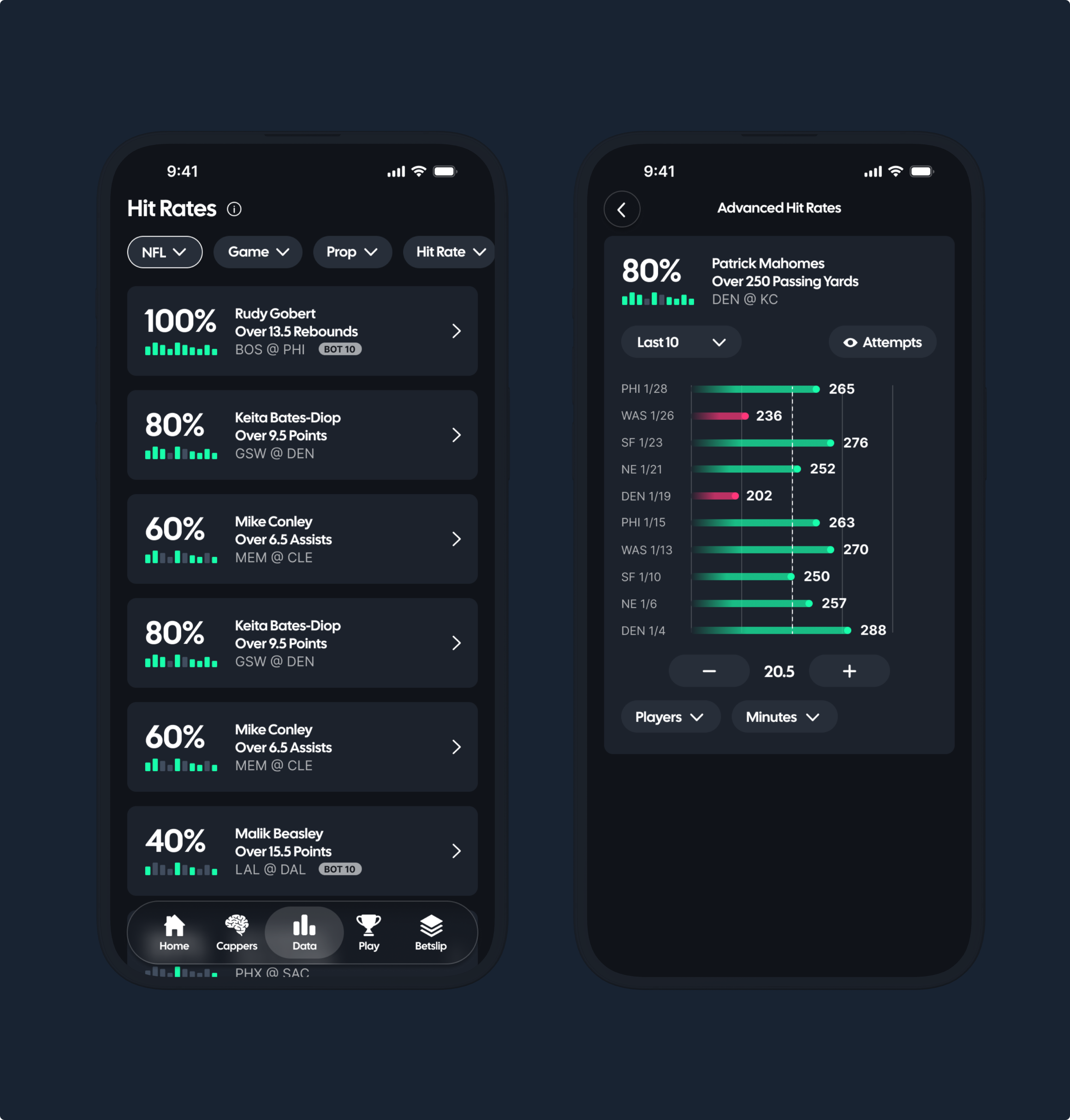
AI Picks Interface
Design goal: Surface AI-generated picks with confidence scores and rationale.
Key elements:
- Confidence score visualized (0-100, with clear color gradients)
- Explanation layer: short text explaining why this pick is span
- Interactive stat drill-downs: filter by sport, league, or prop type
Design trade-offs: Avoid overwhelming users with too many knobs - offer sensible defaults but allow power users to dive deep.
Analyst Picks Integration
GameScript partners with social analysts (e.g., top sports handicappers) to provide curated picks.
Design approach:
- Separate tab for human picks vs AI picks
- Analyst profile cards with credibility signals (followers, win rates)
- Options to “Follow” favorite analysts
Impact: Bridges human curation with data science, increasing emotional engagement.
Mobile App Experience
Given a mobile-first audience, the app design focused on:
- Real-time alerts for new predictions
- Integrating both AI insights and hand-curated signals
- Smooth navigation between sports categories
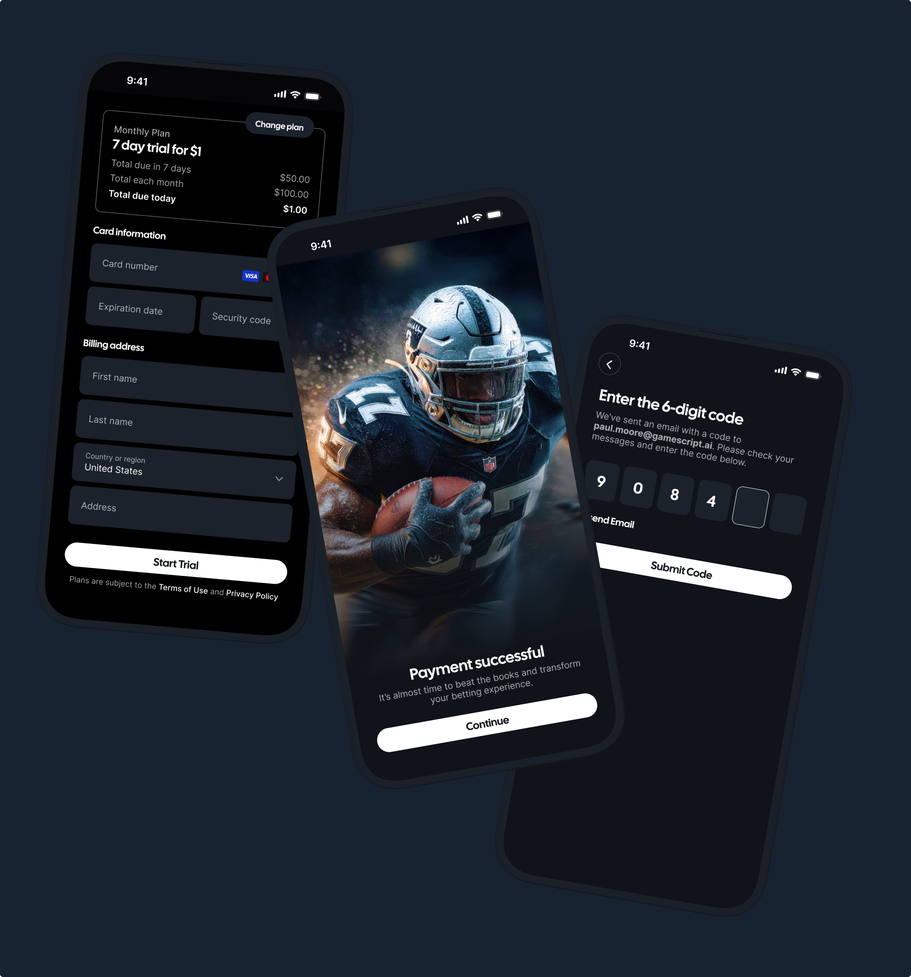
Subscription UI note: Clear pricing tiers, trial CTA, and feature comparisons to improve conversion.
Key Learnings
-
Education fuels retention
Sports fans adopt complex analytics only when the product explains why an insight matters. -
Trust through transparency
Visual explanations of AI confidence and rationale were pivotal to user belief in the data. -
Balance narrative and data
Users respond best when actionable insights are paired with narrative context — not just scores or numbers.