From ideation to launch in three months
Designing a two-sided marketplace that enables landlords and tenants to manage the entire long-term rental process — from listing and discovery to offers and contract signing — without the need for an estate agent.
Role
Founding Product Designer
Product
Two-Sided Marketplace
Platforms
iOS · Responsive Web
Focus Areas
UX, Visual Design, Research, Brand, Design System
The Opportunity
The long-term rental market is fragmented, opaque, and heavily intermediated by estate agents. Both landlords and tenants experience friction, high fees, and limited transparency.
We saw an opportunity to build a direct-to-consumer marketplace — enabling landlords and tenants to manage the entire rental lifecycle without an agent.
Think: Airbnb's directness, applied to long-term rentals.
The challenge?
Launch a fully functioning two-sided marketplace in six months with a team of three.
The Constraint
We were operating inside Reach PLC's Emerging Products division — meaning:
- No existing product foundation
- No established brand
- No dedicated research team
- No large engineering squad
- A fixed three-month launch window
This wasn't a redesign. It was 0 → 1.
And marketplace products are inherently complex: Two user groups. Two value propositions. One shared system.
Defining the Core Problem
Before designing screens, I aligned the team around a clear articulation of the opportunity:
There is no single marketplace that allows landlords and tenants to connect directly and manage the entire letting process in one place.
That sentence shaped every decision that followed.
We weren't building listing pages. We were building an end-to-end transaction system.
Understanding Both Sides of the Market
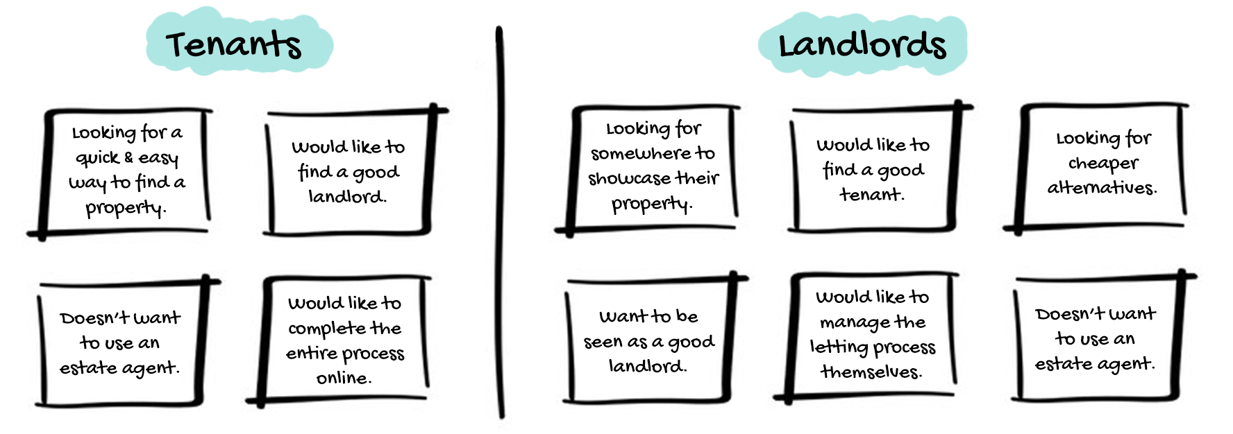
I conducted early-stage qualitative interviews with both landlords and tenants to understand:
- What frustrates them about estate agents
- Where trust breaks down
- What feels risky about direct rental transactions
- Which parts of the process create the most anxiety
Key insight:
Trust and control mattered more than convenience.
Landlords wanted autonomy and reduced fees.
Tenants wanted clarity, legitimacy, and reassurance.
The product had to balance both — without alienating either.
Designing the Marketplace Model
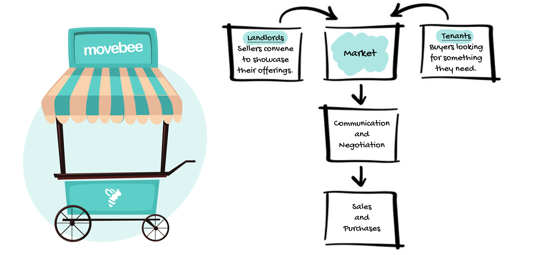
To align stakeholders, I created a conceptual model framing Movebee explicitly as a two-sided marketplace:
- Landlords = vendors
- Tenants = buyers
- The platform = transaction facilitator
This clarified a critical principle:
Every feature had to serve one side of the market without degrading the other.
That lens informed prioritisation across the entire roadmap.
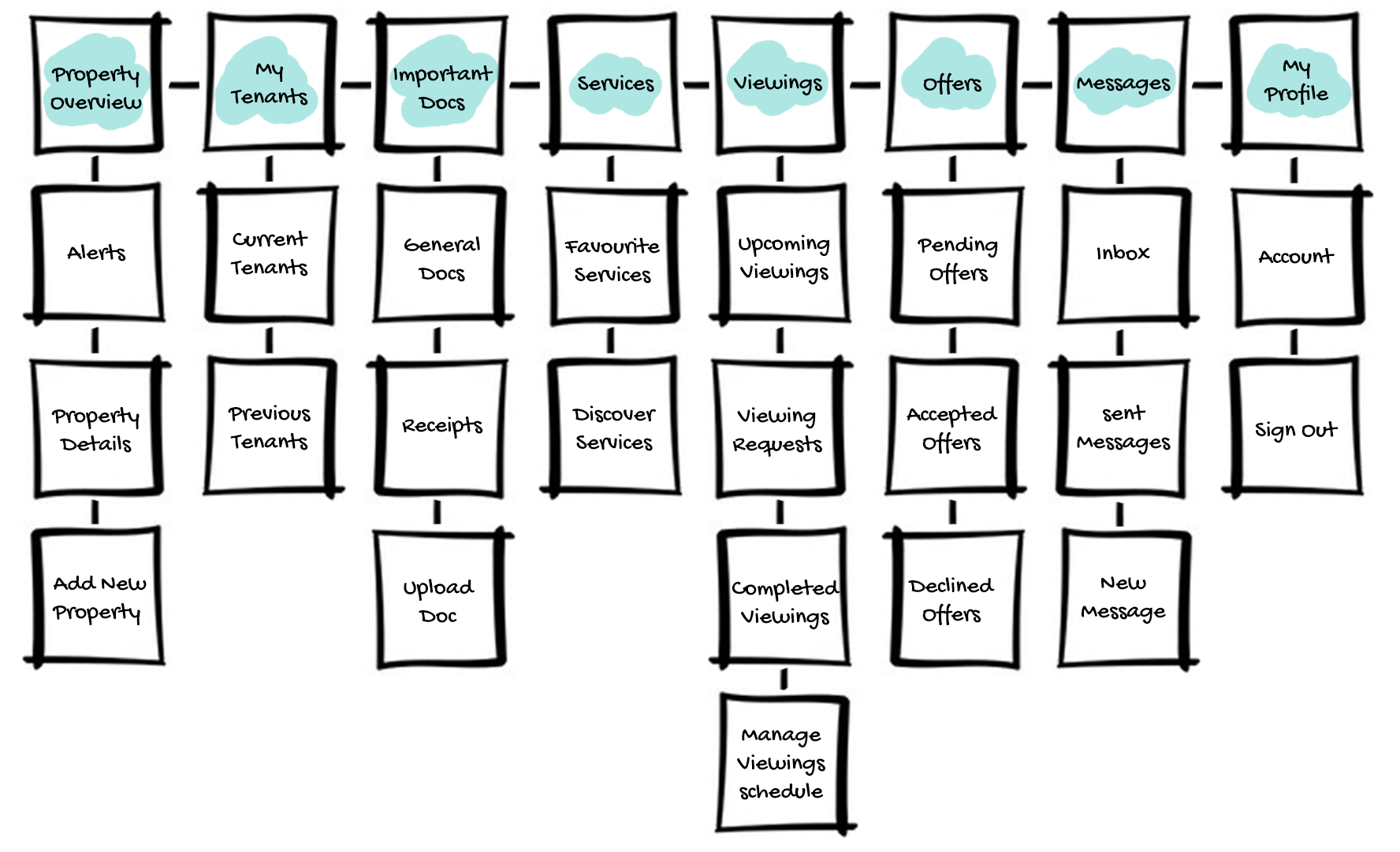
Information Architecture for Dual Audiences
Designing IA for two user types is fundamentally different from designing for one.
I mapped:
- Separate landlord and tenant journeys
- Shared infrastructure (messaging, contracts, offers)
- Edge cases (role switching, disputes, incomplete flows)
The result was a structure that felt personalised while maintaining a unified system underneath.
This prevented the product from feeling like “two platforms stitched together.”
Designing Under Extreme Time Pressure
With three months to launch, I made two strategic decisions early:
1. Build a Modular Design System Immediately
Instead of designing page-by-page, I built a reusable component library from day one:
- Form systems
- Multi-step flows
- Status states
- Notification patterns
- Responsive layouts
This allowed us to scale design and development simultaneously.
2. Prototype to Reduce Risk
I created interactive prototypes at multiple fidelity levels to:
- Validate core funnels (listing, search, offer, contract signing)
- Identify usability friction early
- Align engineering before development began
For complex flows, I hand-coded prototypes in HTML, CSS, and JavaScript to simulate real-world behaviour.
This dramatically reduced implementation ambiguity.
Solving the Hardest UX Problem: Trust
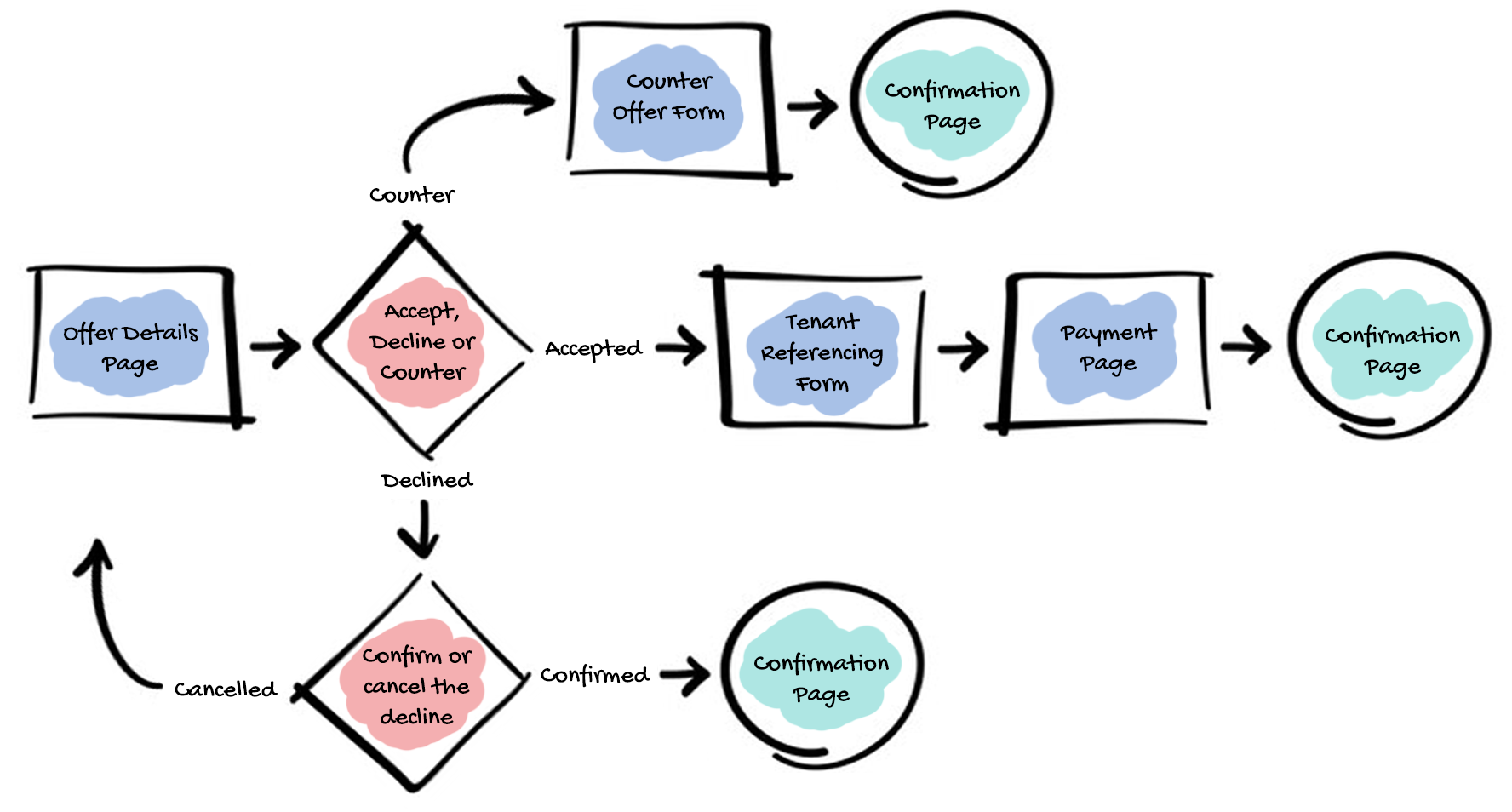
Unlike short-term rentals, long-term rentals involve contracts, referencing, and legal commitments.
The design had to communicate legitimacy and safety.
I introduced:
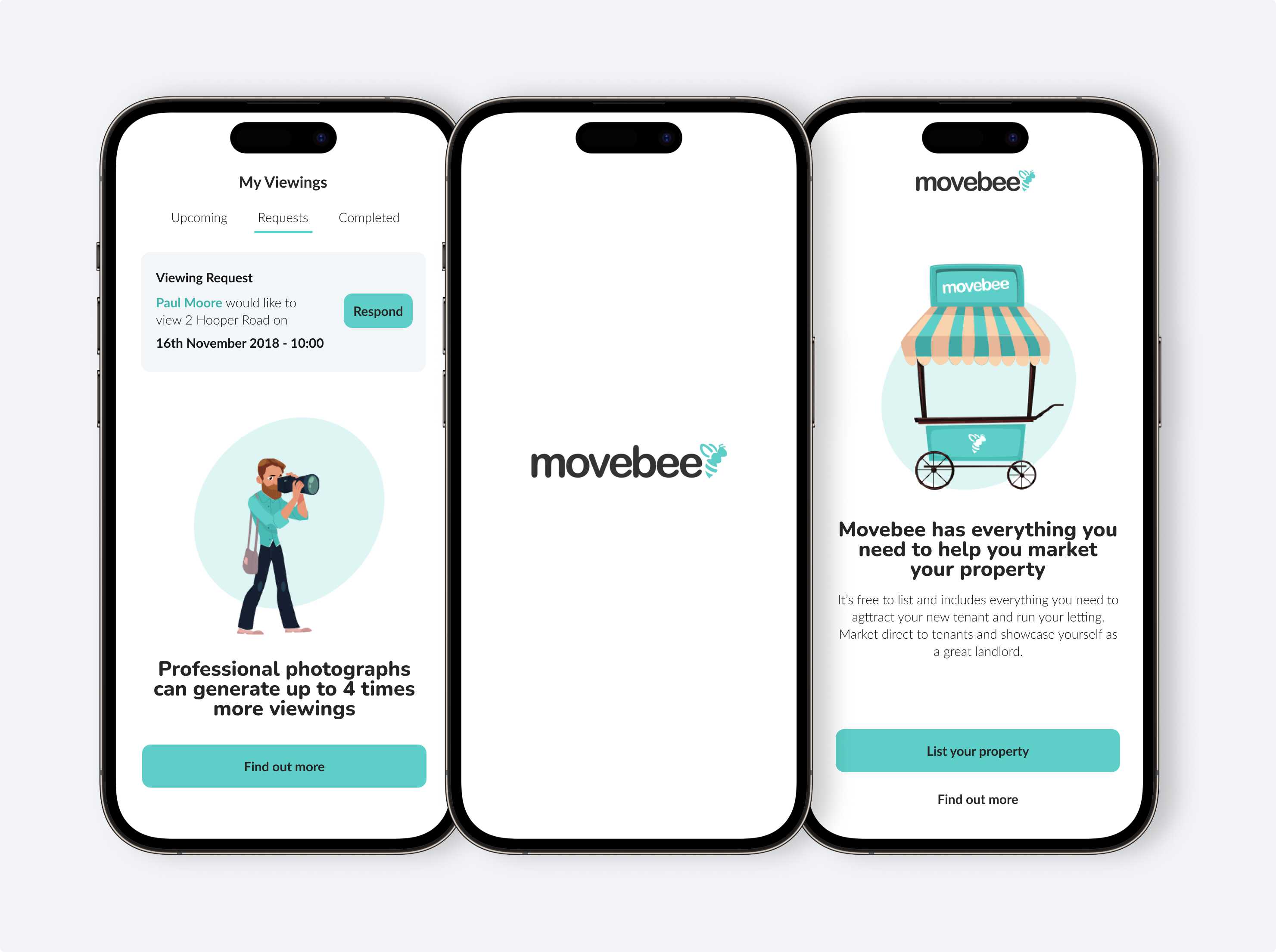
- Clear progress states across multi-step processes
- Explicit confirmation checkpoints
- Transparent messaging flows
- Structured offer submission with clear acceptance states
- Motion cues to communicate status changes
Micro-interactions were not decorative — they reduced cognitive load and reinforced system reliability.
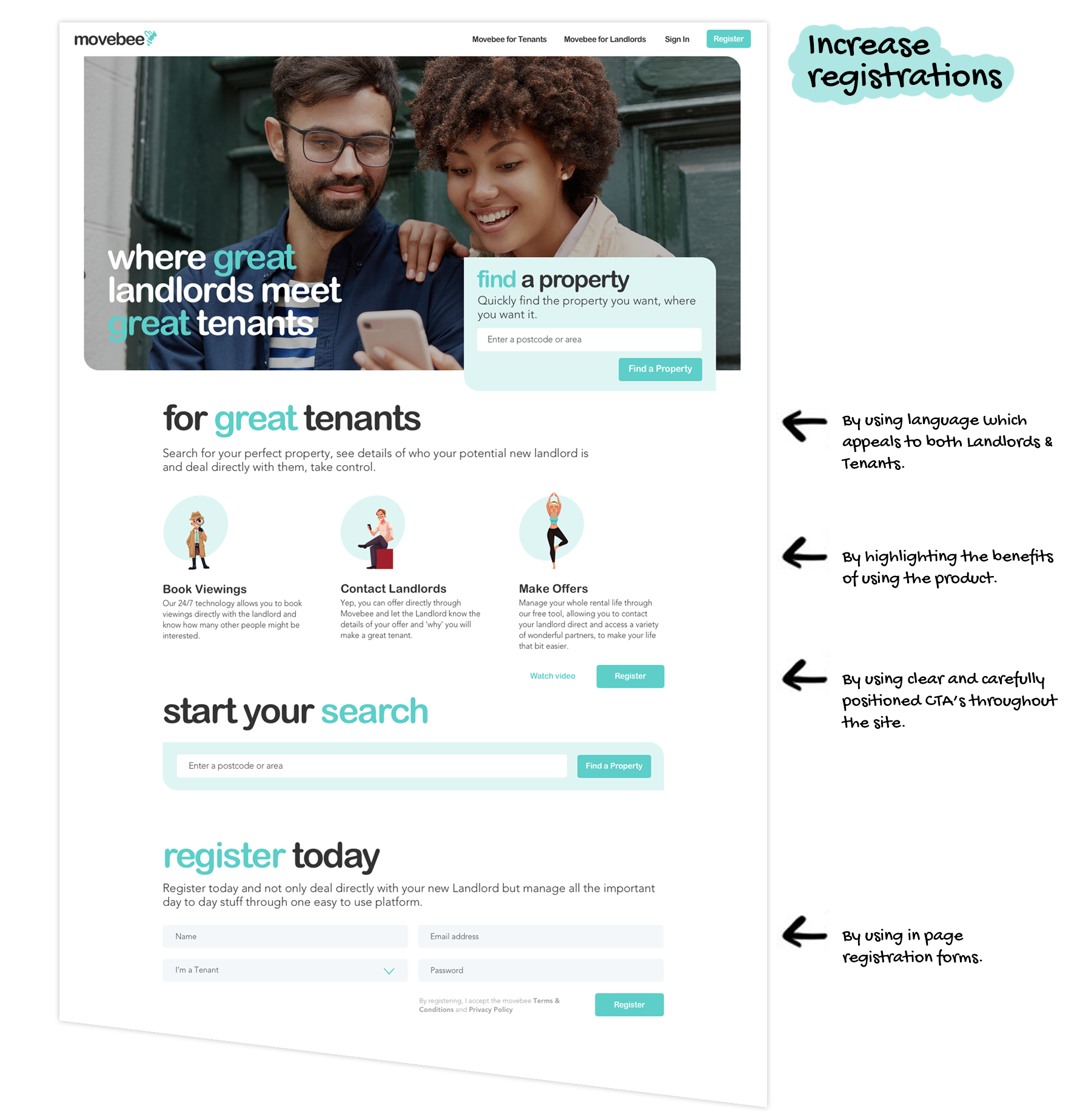
Launch Strategy: Validate Demand First
We launched a stripped-back MVP focused on one core metric:
Registrations from both landlords and tenants.
If supply and demand didn't materialise, nothing else mattered.
The MVP surpassed acquisition targets, validating market appetite.
From there, we phased in additional features as landlord listings increased — reducing risk while maintaining momentum.
Post-Launch Focus: Marketplace Liquidity
After full release, my focus shifted to strengthening marketplace dynamics:
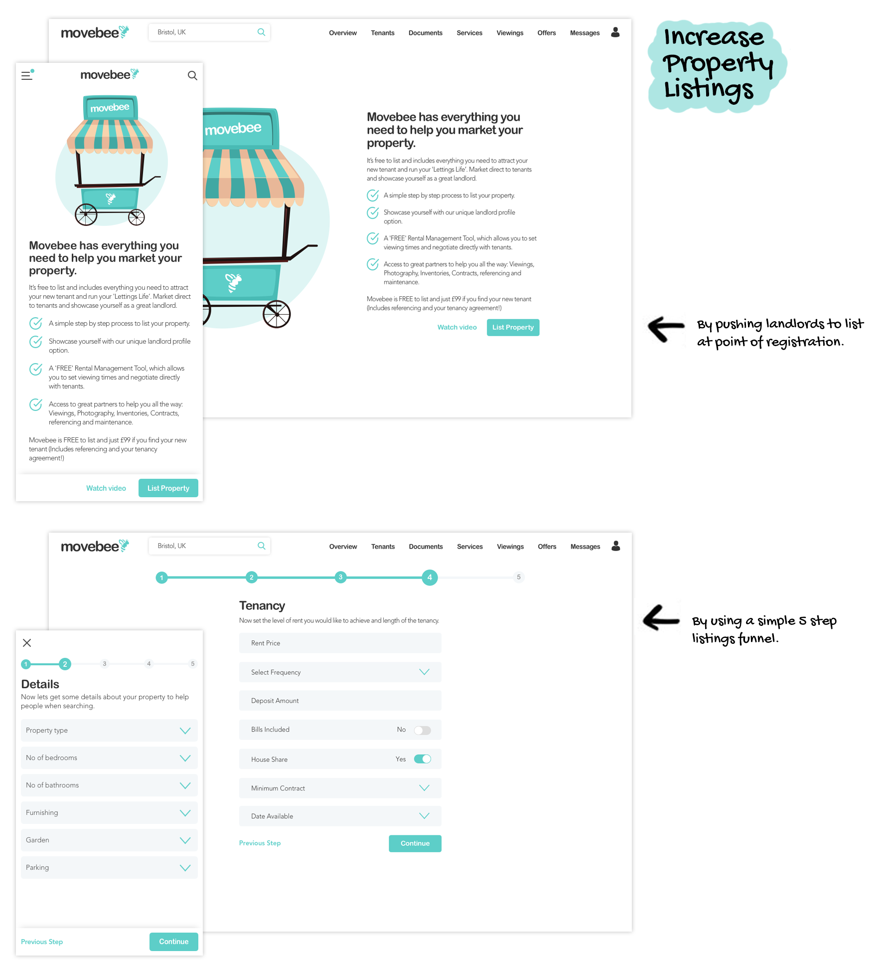
- Increasing landlord registrations (supply)
- Increasing tenant registrations (demand)
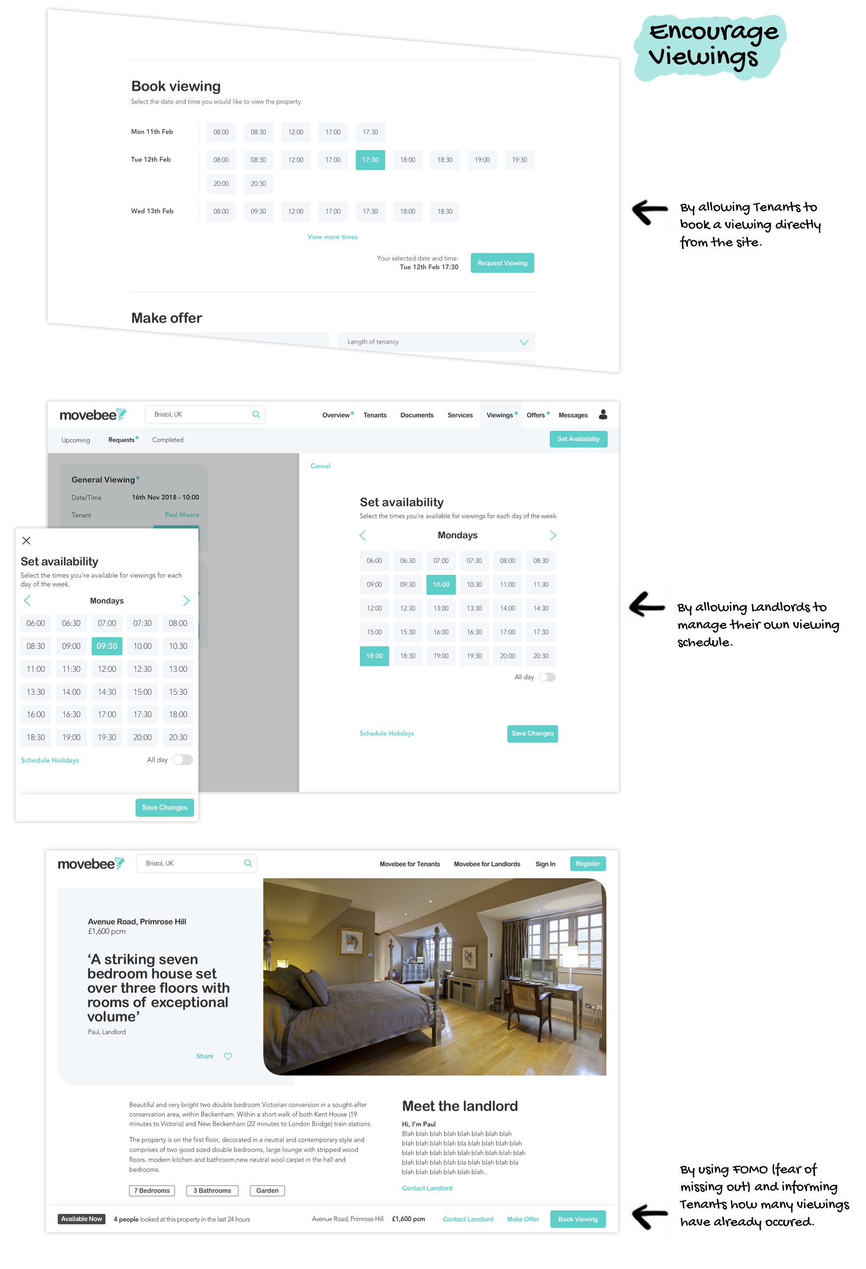
- Driving viewings
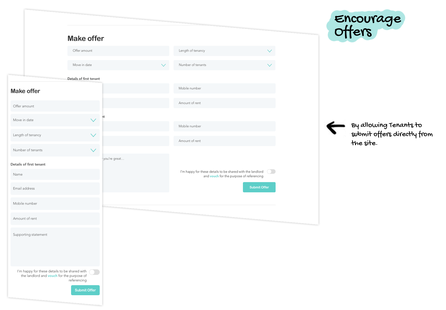
- Increasing offer submissions
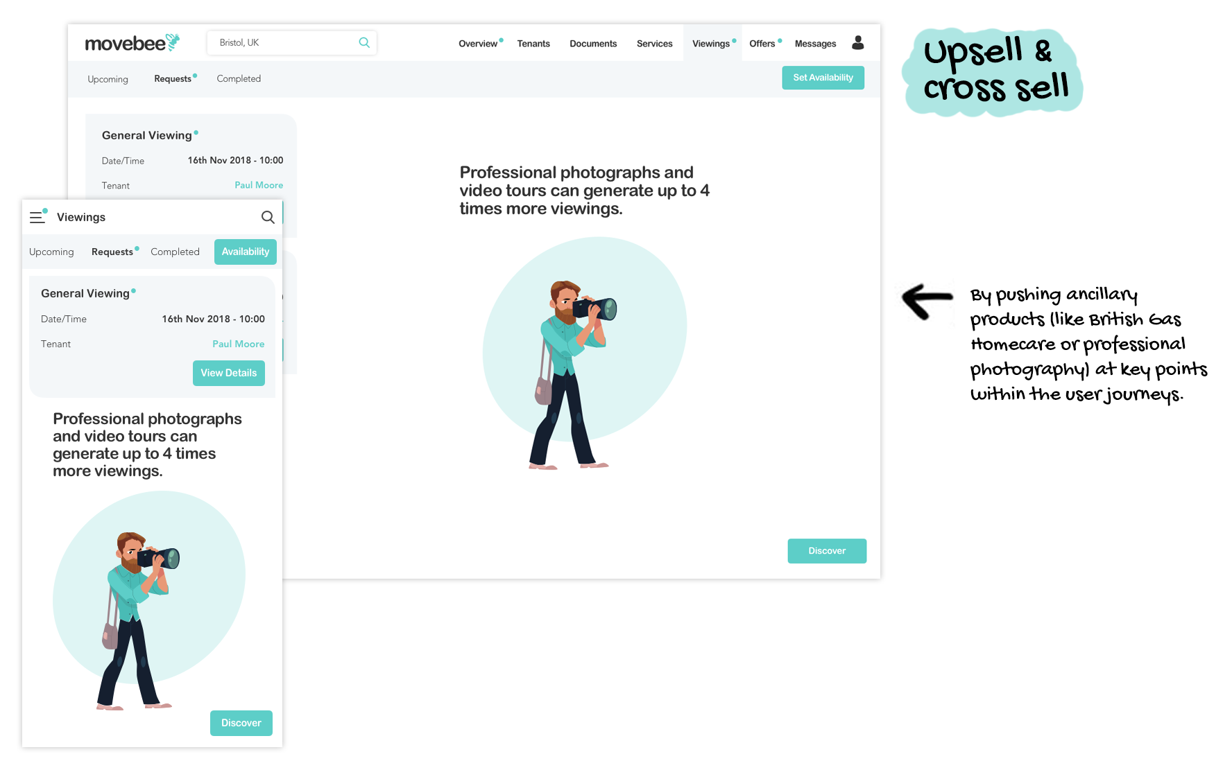
- Supporting ancillary monetisation
Every optimisation was evaluated through the lens of marketplace health.
Impact
- MVP exceeded registration targets
- Core funnels launched on time within three months
- A scalable design system enabled rapid feature expansion
- Successfully delivered a multi-platform two-sided marketplace with a team of three
What This Project Taught Me
- 1. Clarity beats speed.
A well-defined problem statement accelerates execution. - 2. Marketplace design is systems design.
You are balancing incentives, not just building interfaces. - 3. Design systems are strategic tools.
In lean teams, they are the difference between chaos and scale. - 4. Trust is a UX problem.
Especially when money and contracts are involved.